The other day, I explored the slow start of Minnesota Twins slugger Miguel Sano and I used a chart that outlined, as a percentage, how many home runs we would expect a player to have based solely on a hitter’s homer rate as it related to hard hit balls. The article is pretty good and you should definitely go read it if you care at all about me or Miguel Sano or climate change, but the mathy bits that I glossed over were arguably even more interesting than Mr. Sano. (Editor’s Note: I don’t think there’s any climate change stuff in the Miguel Sano piece, but it’s super important. After you read this go google some stuff about the transition to a low carbon, climate resilient economy. 🙂 )
Can we use Statcast data to predict how lucky a hitter has been given their exit velocities and launch angles? What I’m working towards is something like the following:
The Set of Launch Angles and Exit Velocities = An expected number of Total Bases
Those two variables sure seem like they should predict something, and we’ve never had access to this granularity of statistical detail before. The set of launch angles and exit velocities should yield some insight into how lucky/unlucky a player has been. A batter can control little else than how hard and at what angle he hits a ball. With the idea that the baseball gods even everything out eventually, that level of knowledge should allow us to predict marginal breakouts that make all the difference.
The attempt here is to normalize those annoying defensive anomalies. How many flyouts should have been doubles, or even homers? How many line drives could have been triples if they were hit 5 feet further from a defender? That 390 foot blast that hit off the right-center wall at Turner Field for a double would have been a homer if only slugged in any of the other 29 parks. Or even if a batter barely mishit a ball and it turned into one of those really high, really not so deep, yet really exciting flyouts (like what Bryce Harper did to Jose Fernandez earlier this year).
I’ll present a few graphs and then propose a new stat. The graphs are intended to prove to you that there are trends here. While there are roughly a bajillion variables at play here, I’m just trying to sift through the physics noise and bring some of what you care about.
My heart sank a bit when Andrew Perpetua introduced A New BABIP for a Statcast Era over at Fangraphs because I thought he had beaten me to the punch. Not quite. I cite that piece to recognize that there are a few writers playing with the data and trying to find the useful bits; I’m not the only one. But I also cite it because within that piece Andrew does an excellent job of relaying that we’re still a long way from fully understanding baseball:
“[Statcast] gives us a basic estimate of where the ball may land, and a general sense of how much time defenders may have to successfully play the ball. It isn’t, by any means, a perfect solution, but it is the best we have right now, and for the foreseeable future.”
I’m going to call my stat xSLGBB. That stands for x Slugging on Batted Balls. I originally had xSLGBIP for x Slugging on Balls in Play, but homers aren’t exactly in play and they’re included here. You’ll also see SLGBB, which is a player’s real slugging percentage on batted balls. This is inherently higher than most slugging percentages that you will see because it eliminates strikeouts.
Anyway, to the data and methodology! (Skip this part if you don’t like math)
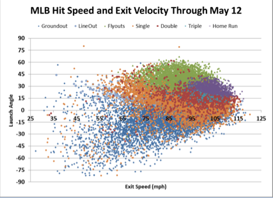
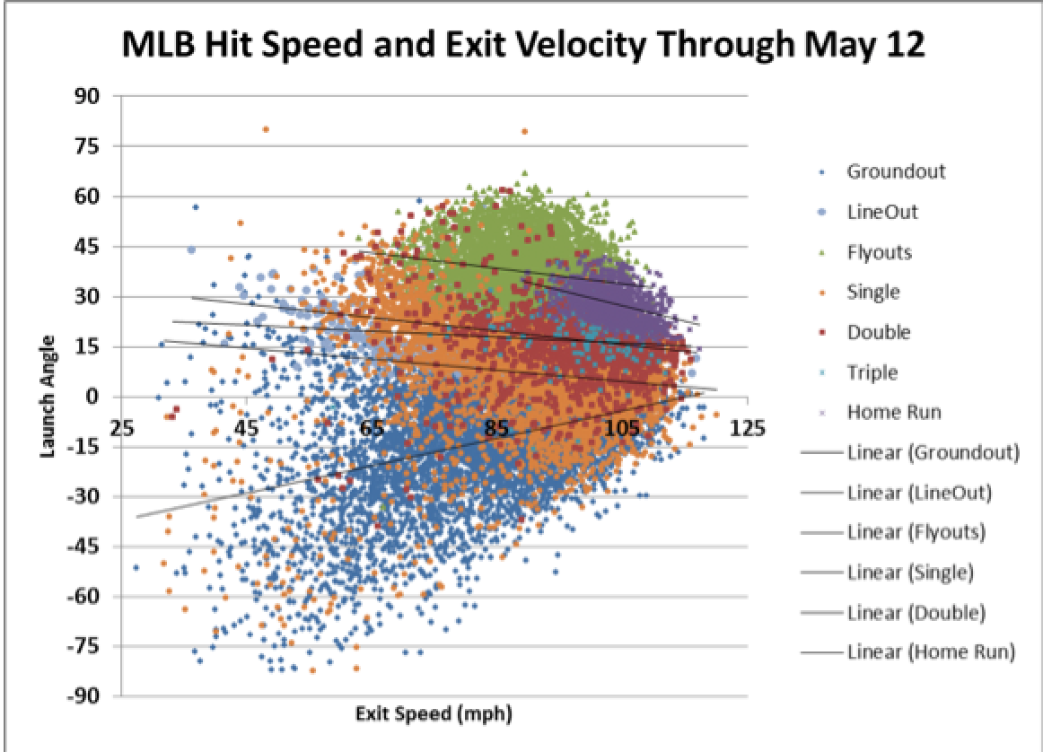
Above you see the results of 20,657 batted balls, sorted by outcome. You’ll notice that the flyouts (green) are generally hit at a higher launch angle, while homeruns (purple) are clustered with a higher exit velocity. Doubles (red dots) are basically homers hit flatter and with less force. Groundouts and singles come in all shapes and sizes, just like the baseball players who hit them.
Below is basically the same graph, but with less noise. I found the average launch angle for each rounded whole exit velocity for each batted ball outcome. Triangles are outs, while the squares are hits.
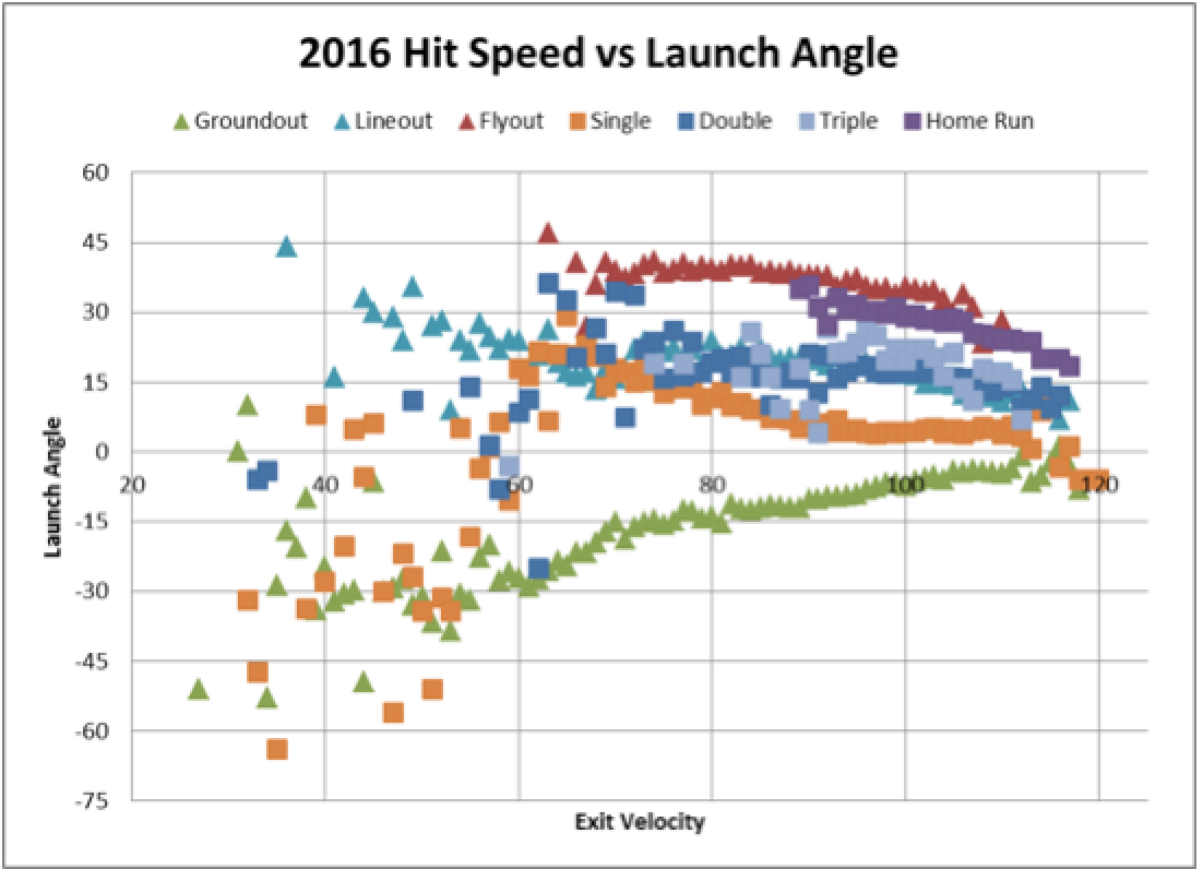
The above graph is impressively telling. We’re able to predict one of the variables (outcome, launch angle, exit velocity) given two of the others to a surprisingly accurate certainty. The r^2 for the homerun line is 0.86. But that’s the simplified graph and we don’t want to extrapolate too much from those averages. Back to the gory math.
Our line of best fit for the homers on the gory side is below. While that R2 might feel small, in a world with nearly 21,000 data points, 0.16 represents a significant trend.
y = -0.4674x + 76.272
R² = 0.1648
Because my mathematics expertise is limited to the undergrad level stats classes that I took 3 years ago, I wrestled with how to take the set of launch angles and exit velocities and predict total bases. I settled on an approach that is probably not the most mathematically valid, but is interesting nonetheless. I calculated the distance of each point on the graph from each of the trend lines for the various outcomes. The basic principle is that each batted ball is awarded the outcome for the line that it is closest to.
I went ahead and removed the triples line from the equation when I realized that my model was handing out far too many triples. The triples line had the smallest correlation, and I really don’t want to try to find a mathematical model that explains Evan Gattis triples.
I built in a sanity check to see if the awarded outcome made sense within the context of what has happened before. The intent here was to prevent awarding a homerun if the ball was hit too high, low, or softly, with similarly built-in checks for the other outcomes.
Because so many of the batted balls were closest to lines that would create an outlier within the category, I also measured distance to the second closest line. That is, many of the batted balls were closest to a line that would represent a profile outside of the outcomes that we’ve seen thus far for that category.
We only had 29 qualify as “Not Sane” across both the closest and second closest lines. Baseball is known for its never before seen moments and that the data has a roughly 0.14% “Not Sane” rate feels like a validation of my methodology. I’d be a bit concerned if all the baseball data fit in a mathematical formula perfectly.
I further refined the data by lumping all homers hit under 96 mph into the flyout category. There have only been 41 homers hit at less than 95 mph. That’s about 4%, or 1 out of 30. This methodology frustrated me a little bit because these non homer flyouts could easily have been doubles in a different life, but alas. Such are the decisions that are made when dealing with large data sets.
League-Wide Results
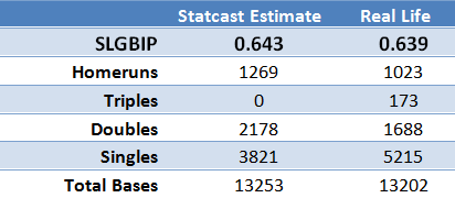
I uploaded the full results onto google docs here, but I will highlight the winners and losers so far. Remember, this data is active as of May 12.
The Top Performers:
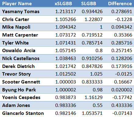
When you make up a new slugging stat you like to see Giancarlo Stanton somewhere near the top. Given the respective hot starts of Nick Castellanos, Trevor Story, and Byung Ho Park, it is nice to see them near the top as well. Yasmany Tomas as the xSLGBB leader is a bit of a surprise. That he’s the leader by nearly 100 points is an even bigger surprise. The guy has a .295 average, 5 homers, and an .832 OPS, but my formula seems to suggest that he could be doing a lot better.
The Underperformers:
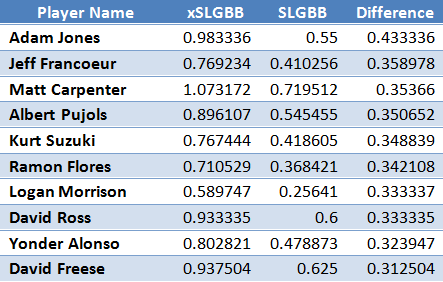
The top 10 of Adam Jones, Jeff Francoeur, Matt Carpenter, Albert Pujols, Kurt Suzuki, Ramon Flores, Logan Morrison, David Ross, Yonder Alonso, and David Freese does little to lend any insight as to if this xSLGBB is the real deal. Carpenter has been good, not great, while the rest have underperformed in the real world, too.
The Overperformers:
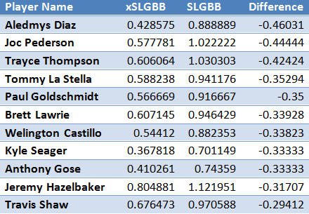
The more I look at how these results play out, the more excited I am about the possibility that this stat provides. Aledmys Diaz, Jeremy Hazelbaker, Brett Lawrie, and Travis Shaw are all crushing things thanks to inflated Batting Averages on Balls in Play (BABIP). Traditional sabermetrics indicated that they were likely headed for a decline in production and this new age stat seems to agree.
Paul Goldschmidt has struggled relative to expectations so far and the Statcast data seems to indicate that things could have been a lot worse for the Diamondbacks first baseman.
Conclusion
It’s a new Statcast-driven world that we’re living in. Bloggers and readers better get used to seeing data manipulated, flipped, and toyed with.
Miguel Sano made me look smart by crushing 3 homers in the days following that piece last week. xSLGBB didn’t predict that same level of breakout. Sano had the almost identical xSLGBB as his real life figures. We’ll see if Yasmany Tomas makes xSLGBB look like the next generation of indicators for future success.
The success of this metric isn’t dependent on how well I market this piece or if Yasmany actually breaks out, but on this piece’s readers spreading the gospel that Statcast statistics will soon reveal more about players than we ever knew before.
Our tools to analyze the game have grown, and so too must our vocabulary of statistics. My xSLGBB, introduced in this piece, is but one of a growing library of stats and tools intended to grow our collective baseball knowledge. And maybe help us win our fantasy leagues.
-Sean Morash