Donnie Hart and the Most Left Pitch

Last week, I published a quite lengthy take on the slowest pitch of the year. Jacob Faria had a good sense of humor about it on Twitter, and my odd sense of humor/curiosity did not scare away any of my real-life friends (though the jury is still out on how readers felt about the piece). The general idea of that (and this) article is that the top of any leaderboard – the most extreme outcome of a given category – is worth recognizing, yet the mainstream typically confines its celebration to a very specific subset of all possible leaderboards, and thus many amazing feats – and those who accomplish them – go unheralded. TL;DR: throwing the fastest pitch of the year is an accomplishment, to be sure, but so is throwing the slowest pitch – or the most left pitch.
The most left pitch…
We must first define what constitutes the most left pitch. Is it the pitch that moves the most left? Is it the pitch that ends up the most left? From whom’s perspective? Is it the pitch that starts off the most left? Let’s investigate! Science has a way of giving you answers to questions you never quite knew how to ask.
When you download Statcast data from baseballsavant.com, you get 89 columns of data for every pitch. Some of them are very straightforward (game_date); some are less straightforward (des), but easily contextualized (“Salvador Perez walks” tells me that this column is a description of what happened on the play); some are just obscure to the core (tfs_zulu_deprecated). I reached out to a few of the guys behind Statcast and found the working definitions. Apparently, these things change all the time and keeping them up to date is impractical.
The Most Left Release
The Statcast column related to release point is actually pretty straightforward (Release_Point_X). A simple sort reveals gold: with the working assumption that the measurements are in feet, the most left pitch this year came from Donnie Hart.
Now, Hart is a bit of a lefty specialist. He averages a release point of 4.41 (Or a full 52.92 inches off-center relative to the middle of the plate). His most extreme pitch of the year came in at 4.9 (58.8 inches off-center).
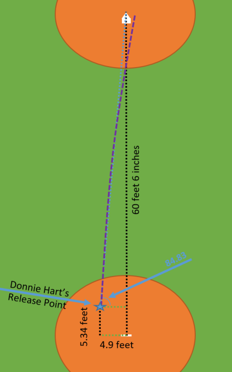
The average human is about 65 inches tall. Which means: This is nuts, and rustled my trigonometry brain cells from their post-college hibernation. At what angle is this pitch coming into the strike zone??? I drew it.
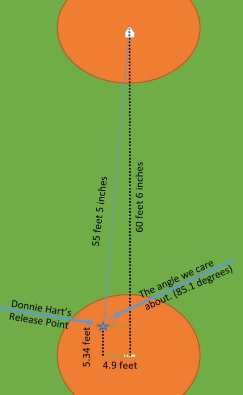
The diagram here helps to simplify things. It’s all to scale. Donnie Hart has the largest green line of any pitcher so far this year. So from this aerial perspective, Hart’s May 30th slider was the most left. But, baseball is a game of angles and perspectives.
We really care about things from the hitter’s perspective, so we need to consider all aspects of where a given pitcher released the ball. In Hart’s case, because he released the ball at 5.34 feet from the rubber, he may or may not have created the most dramatic left release point from the hitter’s perspective. Combining both horizontal release point and extension, we can look into the angle that’s created. In right triangles, the angle that’s isolated in the above depiction and the angle around home plate add up to 90 degrees. So you can think about this problem either as maximizing the angle around home plate (the ball coming in flatter), or minimizing the angle near release.
When we figure out what arctangent means, we realize that Donnie Hart’s May 30th slider is again the most left pitch (which, to be honest, is somewhat disappointing, as I was hoping for some freak pitch that was in the 90th percentile in terms of left-ness, and the 90th percentile in terms of extension – that hope is represented by a heart on the figure below).
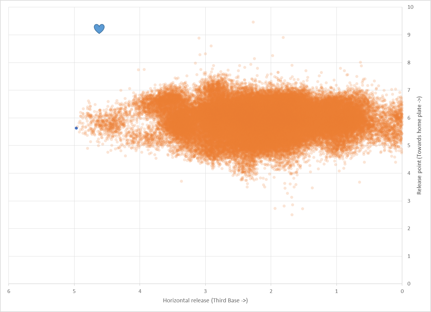
Donnie Hart is somewhat the king of this leaderboard in fact. By this metric, Hart has 55 of the top 60 “leftest” pitches of the year, but let’s look at this May 30th slider.
Donnie Hart has given up just 3 hits to lefties in 18 tries on the year, though he’s spent time in AAA this season. The story is pretty much the same for those poor AAA souls.
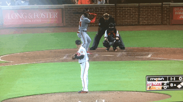
This nasty slider to Bryce Harper calls to mind that the data to this point only considered the release point of the pitch, not what it did once the ball left the pitcher’s hand. For that, we get to look into a new column within Statcast, (pfx_X), which considers the horizontal movement of the pitch between the release point and home plate, as compared to a theoretical pitch thrown at the same speed with no spin-induced movement. It’ll make sense in a minute.
Effectively, (PFX_X) shows us the distance between the purple line and the blue line at home plate. Understanding the angle that is created by where the pitcher releases the ball and the incremental angle that is created by the spin of the ball relative to that trajectory, we can figure out just how flat the ball came into home plate. In Donnie Hart’s instance, which is again the king of this metric, I’ve figured a 7.1-degree off-center offering. If we were to draw a straight line from home plate to the rubber, 7.1 degrees off-center would look like Donnie threw the ball from 7.5 feet towards first base from the rubber. If we extend that out to the second base area, it’s like he threw it from 16 feet to the left of second base.
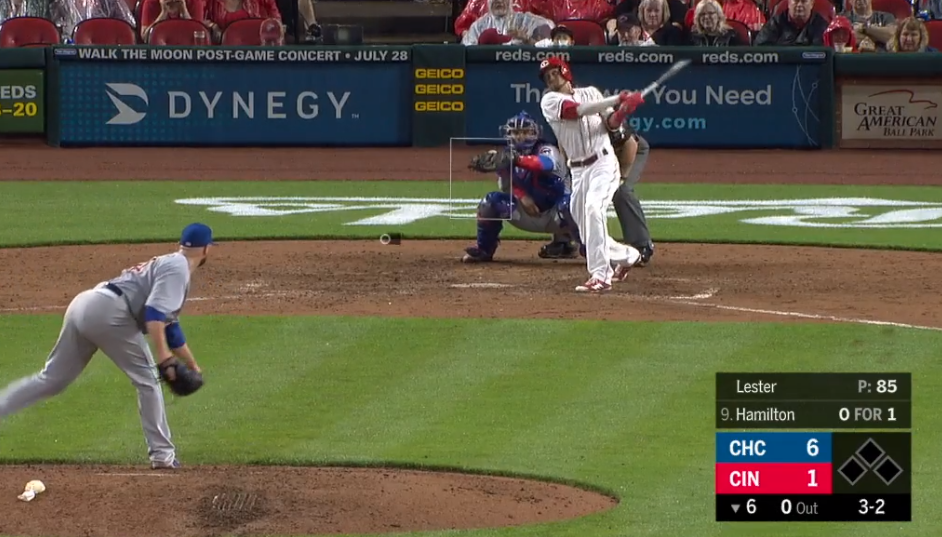
But Donnie was not the king of this in the same way that he was with respect to release point. No. Aaron Loup has 5 of the top 8 pitches. And Jon Lester makes a surprise appearance at the number 2 spot. Let’s look at the Jon Lester pitch because (PFX_X) says the ball moved nearly 4 feet due to spin. Look at where the catcher would have caught it relative to where statcast thought the pitch wound up. Damn. There’s another instance of the statcast data inaccuracies. These types of things happen when we deal on the extreme fringes of large data sets.
Another way to Measure Most Left
To this point, I’ve been overly concerned with where the pitch originated. Another perfectly reasonable metric is where the pitch ended up. That’s a far more straightforward question. Statcast gives us (Plate_X) and (PlateX_Z), which shows us where the pitch crossed home plate. Here’s a plot of all pitches thrown to the left of home plate. The units here are feet.
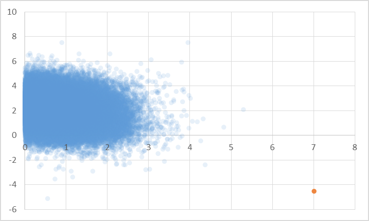
That orange dot can’t be right: 7 feet to the left and 5 feet short? No! Well… Maybe. Let’s check the video.
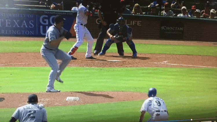
That… is a thing that happened. Jason Adam threw a pitch that did not go as planned. It went down as a wild pitch and a ball, but it was so much more than that. It was the most left pitch of the year! If you watch that GIF 30 times like I did, you’ll pick up a few things:
- Jason Adam immediately looks down on his hand as if it were some foreign entity that had just betrayed him. It’s how I would expect someone to look at their hand immediately after a Buster Bluth type of hand transplant. Presumably, Adam has had 26 years to familiarize himself with his hand.
- The footwork around home plate is awesome. Profar hops, Austin Barnes hops before shuffling, the home plate umpire does a little moonwalk. It’s sequential too.
- It’s not in the GIF, but you should know that Adam did not throw another “curveball” that inning and that he goes on to walk Profar.
Donnie Hart may be the King of Left, but Jason Adam has a place atop at least one leaderboard too, so let’s make sure to celebrate him for it, too.
-Sean Morash