Relief Pitchers Are Still The Best Deal In Baseball
Last season in the MLB was a story of extremes for relief pitchers- many had career years, but seeming just as many relief pitchers completely imploded. By and large though, 2017 was an excellent season for relievers.
Below are the descriptive statistics and standard deviation ranges of MLB Team WARs.
2017 Team Relief Pitching Stats
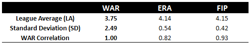
The league average WAR for relief pitching staffs in 2017 was 3.75. That’s a 9% increase from the 2016 season and a 33% increase from the 2014 season – the season that serves as the base-season where this WAR per relief staff has grown year-over-year.
Of course, WAR is still heavily debated, but I believe in its overall effectiveness in determining the performance of a group of players. These improvements by one group of players, however, begs the question -because WAR is additive, are relief pitchers throwing more innings, being deployed more efficiently, or are they actually getting better on a per-inning basis?
For now, let’s discuss this trend in reliever stats at face value with respect to how it relates to the 2018 season and come back to the last two columns of this table in a bit.
A ~ WAR ~ is Coming
As a staunch supporter of the strategic use of relievers to improve a team’s outcome of success over the course of a season, I am now going to show you why you will want me to take your arm and pull you up on to the relief pitcher bandwagon. To show that WAR is normally distributed, I present the least exciting table anyone reading this will care to see.
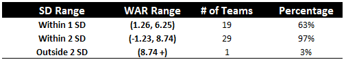
2017 Team Relief Pitching Performance (WAR) Distribution
Let’s look deeper into the WAR ranking, and correlate that to ACTUAL team wins.
It’s hard to quantify the actual importance of saving runs in the later innings because there’s so much noise. However, much like the financial markets – where we can gauge market direction by looking at what the professionals do – we can look at how teams management for each club decides to spend on these players.
Armed with the knowledge that relief pitchers are paid a ridiculous amount given their few innings pitched per season, I went to the next step in this stream of consciousness and thought about it in terms of statistics. The normal distribution breaks data points up into groups. There’s the group closest to the mean, which is said to be within a standard deviation above or below the mean, which in our case would represent 68% (20 teams) of the league. There’s a group within two standard deviations, which includes the first standard deviation group, plus another step out from normal to a group that holds 95% (29 teams) of the league. And 3 standard deviations is where 99% of the data is.
If you didn’t think the last table was sexy, hopefully now you understand it a bit better. But anyway, GROUPING. It’s all about how you group the data, scientific or not.
Hold the Door
For no scientific purpose whatsoever, I thought to group the teams into three bands based on their relief pitching WAR in 2017. Here’s what the data seemed to show:
- Teams that win games know how to use relief pitchers, spend money for the best, and reap the benefits.
- Teams that are average do the same, but in a less pronounced way and see average results.
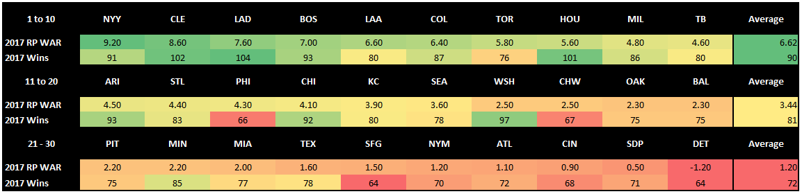
- And the team’s that suck… you get it. The following heat map is banded by these three groups. The teams that win, the teams that are figuring it out, and the team’s that you’ll wait a few more years to watch.
2017 Banded Team Wins and RP WAR Comparison Heat Map
This heat map attempts to make a visualization to show the relation between relief pitchers performance by WAR in 2017 to team wins that season. The presentation aims to be intuitive- green is good for both stats, red is bad. If the two stats are about the same color for a team, we may have something to look into. If there’s a pattern throughout, then we definitely have something to look into.
Turns out, the overall pattern is just that – a pattern. There are a few outliers, of course -in the first band, the Blue Jays won just 76 games with the 7th most effective relief pitching staff in baseball. I’d be more likely to attribute that to the fact that the 1st and 4th most effective pitching teams won 90+ games and were also in their division.
The third band averaged 18 fewer wins with a 5.4 WAR difference with band 1. Comparatively, they absolutely sucked.
Not surprisingly, just like their counterparts in the first band, both data points for teams in band 3 seem to match, though this time they were both red. Again, outliers are apparent, and the 2017 Minnesota Twins still remain a mystery to smarter people than I so let’s not get into their success here.
What interests me most, however, is band 2. The overall averages make sense, but there’s a lot more variance in the underlying data.. This is the band where we can make real inferences and I’m struck by five teams: Arizona Diamondbacks, Philadelphia Phillies, Chicago Cubs, Washington Nationals, and the ChicagoWhite Sox. Here’s what I think I can tell:
1. Offensive power is expensive, but it wins games. When you can assemble it cheap, do it.
The Cubs and Nationals were playoff contenders and they were 4th and 5th respectively in league offense by WAR, so it makes sense. It also makes sense that they were the two top teams looking for relief pitchers down the stretch.
2. When your relief pitchers are your best players, sell them.
The Phillies and the White Sox were both terrible, but not really in the relief category. The only thing that stands out to me to explain their outlier status is that both teams were/are in the middle of a huge rebuild- they had the 1st and 3rd youngest teams in the league in 2017. Furthermore, they had great relief pitchers for a half of a season before trading them to help their respective rebuilds. The White Sox, most notably, sent Tommy Kahnle, David Robertson, and Tyler Clippard off at the deadline and the Phillies parted with Pat Neshek.
3. The secret to theDiamondbacks overachievement? Second best starting pitching staff in the league.
Yes, you can achieve results with over-powered bats and an entire deck of aces on the mound, but in the end, you’re only as good as your last man out of the bullpen. Assembling a roster of aces or power hitters is near impossible unless you have a combination of money, superior scouting, and the luck of a leprechaun. Instead, assemble a solid team and back it up with a relief core of high-quality arms and you’ll more than likely have a good squad at a fraction of the cost of other approaches.
In the follow-up to this piece, I’ll be looking further into band 2 of the heat map a little deeper and figuring out what these teams have done in the offseason to bolster their bullpens, if anything at all.
All player performance data included is courtesy of fangraphs.com. All contract-related information is courtesy of Sportrac.com. Any additional metrics are created based off of the data from these sources.
-Pat Lotane